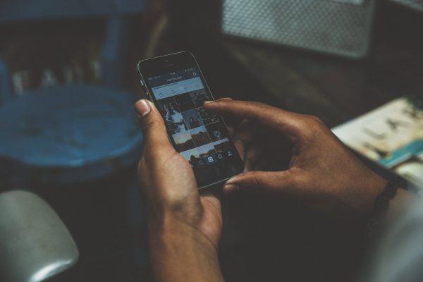
My first reaction – conditioned by the sudden and often jarring layout changes I’ve seen other social platforms make — was to totally reject the new layout and lament the loss of the look and feel of an app I once knew.
what is this new and foreign instagram layout pic.twitter.com/BR09uAy1lr
— Maggie Murphy (@maggie__murphy) April 26, 2016
FYI. it’s so… white pic.twitter.com/yadPHoBokY
— Maggie Murphy (@maggie__murphy) April 26, 2016
Noooooooooo pic.twitter.com/1mCUqrM3mQ
— Maggie Murphy (@maggie__murphy) April 26, 2016
Yes, my first take was a bit dramatic, but I’ve since changed my mind. I actually really, really like the redesign, and I hope it stays. Of course, whenever one of our beloved platforms changes (ahem, Facebook) we all want to whine about it. This particular change, however, grew on me almost instantly because it improved the way my photos and feed were presented. For those of you who take Instagram as a serious place to share your beautiful content, this change will be welcome.
Instagram’s minimalistic redesign makes everything black and white — except for hashtags and @ tags, which remain blue. Images now really pop, especially when you choose to do a full bleed vertical or square sized image. The images, dare I say, look even bigger now that the blue bars have left the design in exchange for clean white. White space is utilized in every respect, including some new minimalized app icons. The activity icon has been simplified to just be a heart. The classic orange notification button has been replaced with a bold red, another noticeable difference. The camera itself has even been reduced and simplifed to a minimal grey button.
The editing feature itself has also changed to look cleaner and clearer. You can now see a thumbnail of the effect you choose much more clearly than before, especially if you have the iPhone 6 or 6Plus.
I was one of the lucky few to get a peek at the redesign before it was rolled out to the public, so you may not see these changes immediately (or ever). I’m just using this blogging platform to take back my negative tweets and give Instagram the thumbs up!
*EDITOR’S NOTE: An official update from Instagram on May 11th rolled out the new design and icon. What do you think of the update? Tweet your opinions at us @DiditMarketing!
- 10 Mistakes to Avoid When Using QR Codes for Marketing - September 20, 2023
- Kevin Lee on How AI Changes the SEO Landscape - August 31, 2023
- The Power of Compound Marketing: Kevin Lee Presents @ 1MediaWorld 2023 Global Conference - March 7, 2023
