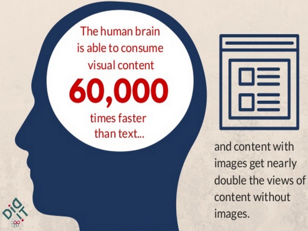
April 24, 2015: The purpose of infographics is to visualize data, to communicate information clearly and effectively. Its not an easy thing to do as it requires a designer to understand the data first, then visualize the way to display it for others. Infographics created by clueless or inexperienced designers are often put together purely as link bait, with no meaningful content or worse — content that “lies.”
Some basic things to avoid include:
1. Text Overload (too much text kills any info graphic, no matter have well designed it is).
2. Inaccurate Data (relationships between variables should reflect the numbers correctly).
3. Irrelevant Data – (Is this data important to your target audience? If it isn’t it will simply add confusion.)
4. Generic styling (It’s still design, and a default bar chart will be very easy to ignore).
A good infographic has a great layout, well considered colors, and a visual style. It’s the perfect combination of journalism, data analysis, and digital arts.
- 10 Mistakes to Avoid When Using QR Codes for Marketing - September 20, 2023
- Kevin Lee on How AI Changes the SEO Landscape - August 31, 2023
- The Power of Compound Marketing: Kevin Lee Presents @ 1MediaWorld 2023 Global Conference - March 7, 2023

