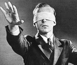
June 5, 2014: As one of the oldest methods of advertising on the Internet, the lowly banner ad needs a lot of help to combat the phenomenon known as “Banner Blindness.”
What Is Banner Blindness?
Web users scan sites very quickly; scientists who track clicks and eye movements have found that users consciously or unconsciously “screen out” site design elements that resemble ad units. Such are users are “blind” not just to advertising banners “but to anything that looks like an advertising banner,” says usability guru Jakob Nielsen. Banner Blindness is compounded by the fact that many Web sites run too many ads in too many design elements, and these ads often have no targeting logic behind them that make them more than marginally relevant to the task being performed by users.
How to Fight It
Unlike search ads — which only appear in response to a user query, and thus have relevancy “baked into them,” banner ads (which are typically targeted contextually) must fight an uphill battle to be perceived as relevant, interesting, and click-worthy. So you’ve got to put a lot of thought into how your banner ads will be served (via contextual networks, direct site buys, or via retargeting). And you’ll need to put thought — and care –into crafting the ads themselves.
The good news is Didit knows which methods can move the needle for you. That’s why we published The Smart Guide to Better Banner Ads. Think of it as Banner Ad Therapy 101 for your display ad campaigns.
You can get our new e-book right here.
- 10 Mistakes to Avoid When Using QR Codes for Marketing - September 20, 2023
- Kevin Lee on How AI Changes the SEO Landscape - August 31, 2023
- The Power of Compound Marketing: Kevin Lee Presents @ 1MediaWorld 2023 Global Conference - March 7, 2023
