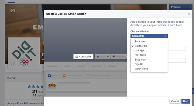
Facebook Pages has a new(ish) tool that many business pages seem to be ignoring. Find out best practices for your new CTA button.
March 10, 2015: Back in December, Facebook announced the addition of a call-to-action button for Facebook Pages. This was a nice little peace treaty offering from Facebook, whose algorithm changes had made some small businesses a little bit unhappy. Over the next several weeks, this feature was rolled out to all business pages. We’ve noticed that many small businesses, due to either lack of knowledge or a busy page manager, have not yet taken advantage of this button yet.
Making your CTA is extremely user-friendly and can be done in minutes. Which of the seven available CTA options is best for you? Because Didit is a B2B, we saw “Contact Us” as the call-to-action that made the most sense. If a user clicks our CTA button, it leads them directly to the “contact” page and form on our website. Analytics on Didit.com allow us to attribute Facebook’s share of leads very accurately.
You can edit and change the button whenever you want. Facebook even includes “clicks” in your insights so you can track how well the button does. It’s also important to coordinate your business page’s visuals with the button, as it’s right on top of your cover image. It also will appear on your mobile site.
- BOOK NOW: Ideal for hotels, restaurants, spas, airlines, and any appointment-based businesses. Lead your customer directly to your booking page. With this strongly worded CTA, they’re ready to purchase (or at least see rates).
- CONTACT US: This is a softer CTA, meant for B2B’s, law firms, and service offices. Direct your customer to a lead form on your site with several ways to contact you on it as well (phone, fax, e-mail, etc.).
- USE APP: This one is pretty self explanatory and primarily meant for App pages. Lead your customer directly to your iTunes or Google Play store page. If your company isn’t primarily an “app” business but introduced an app, creating a banner that advertises it and changing your CTA to this option for a while is a great idea.
- PLAY GAME: Meant for the booming gaming businesses on Facebook.
- SHOP NOW: Ideal for retailers and product pages. If you’re running a sale or promotion, advertise it with your header image and direct customers to your “sale” pages online. Similar to “book now” the user that clicks this is ready to shop, so having a direct link is important.
- SIGN UP: This CTA is great for fundraisers and events. If you’re looking for volunteers or donations, “sign up” is the CTA for you. If you’re running an event, your CTA can lead to a form or the Facebook event page that you create for it. Don’t forget to advertise that event with your cover image.
- 10 Mistakes to Avoid When Using QR Codes for Marketing - September 20, 2023
- Kevin Lee on How AI Changes the SEO Landscape - August 31, 2023
- The Power of Compound Marketing: Kevin Lee Presents @ 1MediaWorld 2023 Global Conference - March 7, 2023

