August 18, 2014: Landing pages are often the weakest link in the conversion chain. Marketers often don’t give enough thought to the pages serving as destinations for their search, social, and display media ads. I’ve looked at a lot of landing pages in my time; here are the best practices I’ve found that can markedly improve the performance — and conversion ratios — of your landing pages. I include examples showing good (and poor) landing page design and execution.
1. Focus
You want to have the main headline of your landing page match the ad copy your visitors clicked on to get to your page. When you make the mistake of directing PPC traffic to a generic home page, it’s almost like a game of “bait and switch.” You want your users to focus on the offer or product mentioned in the ad, so there is no disconnect. Potential customers are easily distracted from conversions, so take them down the path they expect. Consistent messaging is key here, so keep the process seamless from ad to landing page.

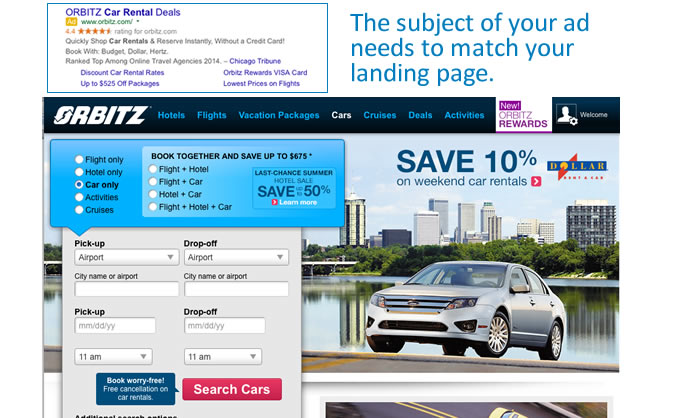
If I’m looking for a Car Rental, then its obvious that I should arrive at a Car Rental Page.
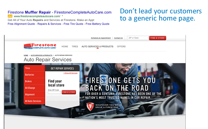
A complete disconnect from your Google search campaign. Where are the mufflers? It’s not even mentioned as one of the core services here.
Remember, you have only a few seconds before a customer decides to stay or go, so make the choices very easy. Offering too many things to click on can disrupt the buying process, so keep focused on your page goal here. Google wants that clear path from keywords to landing page too. Landing pages with low bounce rates will have a positive influence on Quality Score and Ad Rank, making your PPC campaigns much more efficient and profitable.
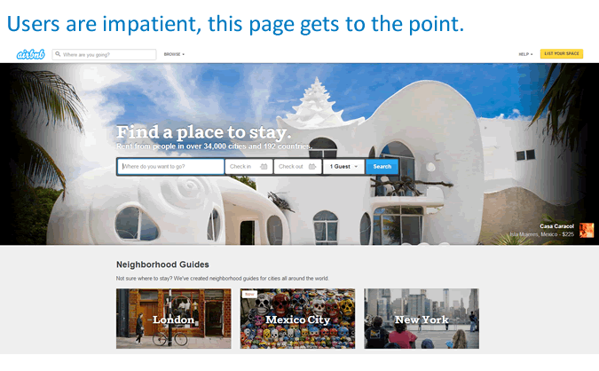
2. Be brief
Your landing page should have a single purpose and a brief focused message. Your business offering should be clear, instantly recognizable, and targeted to the user’s motivations. If you really know your target audience, you can design a page that recognizes their needs and how your product or service can meet them. Make the information on the page quick to absorb through the use of images and bullet points. The page should contain just enough information to let visitors make an educated decision to buy, and not a single word more. Avoid clutter above the fold of the page so users aren’t distracted into doing something else or worse, leaving the page. This information should load quickly, because online customers abhor waiting for graphics or media files to load. Use Google Page Speed Insights to measure how quickly your page loads.
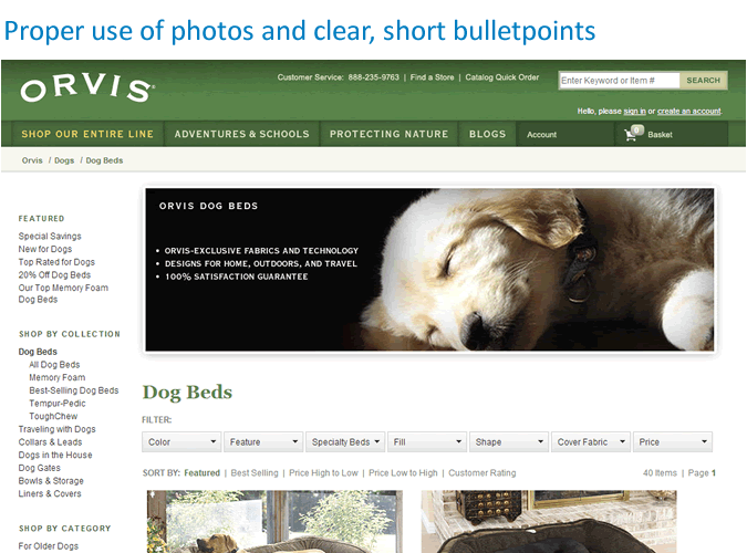
3. Show it
Use graphics, video, and clear, short copy to illustrate why your product’s great. Yes, you want to keep your information succinct, but you do need to show visitors what your service/product looks like. Big images and bold visuals can illustrate why users should purchase. Video has been shown to improve conversion by up to 80%, so use it. Other incentives you can try to get users interested are:
• Co-branding – this increases trust by association with a known brand or partner
• Free Trial – long used by software products, it builds trust and loyalty.
• A product guarantee – removes the “risk” barrier and complements testimonials.
4. Make conversion easy
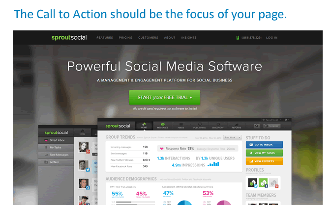
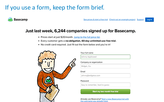
Visitors to your page want things to be easy, so cut your copy to the bare minimum (most will scan a page, not read it). Grab your visitors’ attention with visual cues to guide the eyes of your potential customers to a strong, unambiguous CTA (Call-to-action). This CTA should be big (even over-sized) and positioned above the fold of the page. If it’s part of a lead gen form, visual cues should point down the page to it but the form itself should be short because many people bail from long forms (more than 6 fields is too long). Avoid things users hate on landing pages like pop-ups, music, and bad stock photography. Make clear the rewards you give customers for converting on your page. Users also want to know their information is confidential, so include links to a privacy statement on your page.
5. Be real
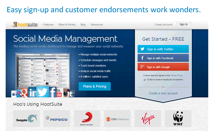
The Internet is full of con artists and get-rich-quick schemers, so if you want to be taken seriously as a legitimate enterprise you’ll to show some proof on your landing page. A phone number and online validations (such as a Better Business Bureau member or Verisign badge) can help. Do your best to avoid sales puffery or gimmicky headlines. If you use testimonials, make sure they are authentic, real people – preferably reachable through social media or links. People will see through the hyped up personas and you’ll lose visitor’s trust instantly, so don’t exaggerate. Run landing page tests to measure the effects of testimonials on your landing page.
6. Always be testing
Landing page successes do not happen overnight, and are very rarely the result of the marketer’s gut instinct. To get real insights into how your audience thinks, you need to test your landing page. Simple A/B tests let you measure the conversion impact of changing one element of the page at a time. Some things to test are:
• Layout
• Primary headline
• Call to action
• Primary graphic on the page
• Bullet points
• Form length (number of fields)
Produce several versions of a page and use Google Analytic’s Content Experiments to see which page gets the most conversions. You may find that “ugly” pages perform better for your target audience. Bounce rates are an important statistic, showing what turns users off to your page. Let your customers decide which page works best and keep refining to get the increase in conversions you’ve been working for.
Have a question about Site Design, SEO, or Content Marketing? Contact us.
- 10 Mistakes to Avoid When Using QR Codes for Marketing - September 20, 2023
- Kevin Lee on How AI Changes the SEO Landscape - August 31, 2023
- The Power of Compound Marketing: Kevin Lee Presents @ 1MediaWorld 2023 Global Conference - March 7, 2023
