April 16, 2015: Each year, U.S. News & World Report compiles a list of the best hospitals and health care institutions in the United States. Because Didit is located in the New York metropolitan area, we decided to look at sites maintained by the 52 top-rated institutions in this area to evaluate their mobile-friendliness, a factor that Google has indicated will be used to determine organic search visibility on mobile devices..
This study is the latest in our pre-4/21/15 series of evaluative surveys, which, to date, have included:
a) Major U.S. PR Firms (published 4/2/15)
b) Large-cap companies on Long Island (published 4/6/15)
c) Major New York-based advertising agencies (published 4/9/15)
d) Major U.S. Charities (published 4/14/2015)
e) Major “White Shoe” law firms in the U.S. (published 4/15/15)
Methodology
Didit ran each health care institution site through Google’s Mobile Friendly Test application page (https://www.google.com/webmasters/tools/mobile-friendly/) to see whether Google considers each site “mobile-friendly.” The specific error types causing any test failures were logged, and a screen capture was made of each report. Testing was begun and concluded on 4/3/2015.
Here is a summary of findings:
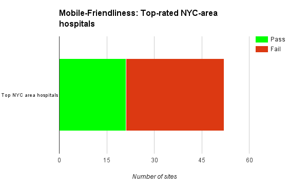
1. 40 percent (21) of the 52 hospital sites surveyed are fully “mobile-friendly” according to Google’s definition.
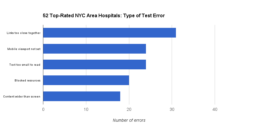
2. The most common errors seen on the 31 sites failing Google’s Mobile Friendly test were:
a). Links spaced too closely together to be easily clicked on mobile devices. 25 sites had this error.
b) Mobile viewports not being set correctly. This error can cause the site to render in less than 100 percent of mobile display space. 23 failing CPA sites had this error.
c) Text being set at a size too small to read on mobile devices. 23 failing sites had this error.
d.) Blocking of resources necessary for the Googlebot to correctly parse the resources referenced by the web page. 19 hospital sites had this error.
e) Content wider than screen. This error can cause the site to become arbitrarily “cropped” along the horizontal dimension when viewed on a mobile device. 15 failing sites had this error.
Analysis
 Hospitals and care institutions use their websites for a variety of purposes, including branding, recruiting, PR, and as a portal for clients to approach the institution directly. Given the sizeable investment many have made in their web properties, it would seem reasonable that hospital management would prefer that these sites render as well on mobile devices as they do on traditional large format desktop displays (i.e. be “mobile-friendly.”)
The fact that a given health care institution fails to pass Google’s Mobile Friendly Test does not mean that it will be invisible on mobile devices. But Google has indicated that poor showings on this test may result in less visibility in search results made from mobile devices under certain circumstances. This is a growing concern as mobile traffic — and searches made on mobile devices — increase in importance. Digital marketing consultancy firm Emarketer.com has observed that “2015 will see mobile search reach the tipping point — the stage at which the majority of spend, organic traffic, and paid clicks comes from smart phones and tablets.”
Didit’s findings should not be cause for panic. In most cases the actual problems causing a “Fail” on Google’s Mobile Test can be quickly resolved — sometimes in under an hour. Because health care institutions have only a few days to rectify these problems, senior management should take this issue seriously and make any corrections required in time for the 4/21/15 deadline.
- 10 Mistakes to Avoid When Using QR Codes for Marketing - September 20, 2023
- Kevin Lee on How AI Changes the SEO Landscape - August 31, 2023
- The Power of Compound Marketing: Kevin Lee Presents @ 1MediaWorld 2023 Global Conference - March 7, 2023


